006Lowlight
Near-black surfaces stacked a few shades apart, small medium-weight type in four greys, and colour only where it means a state.
Use it: tell your agent
make my web app in 006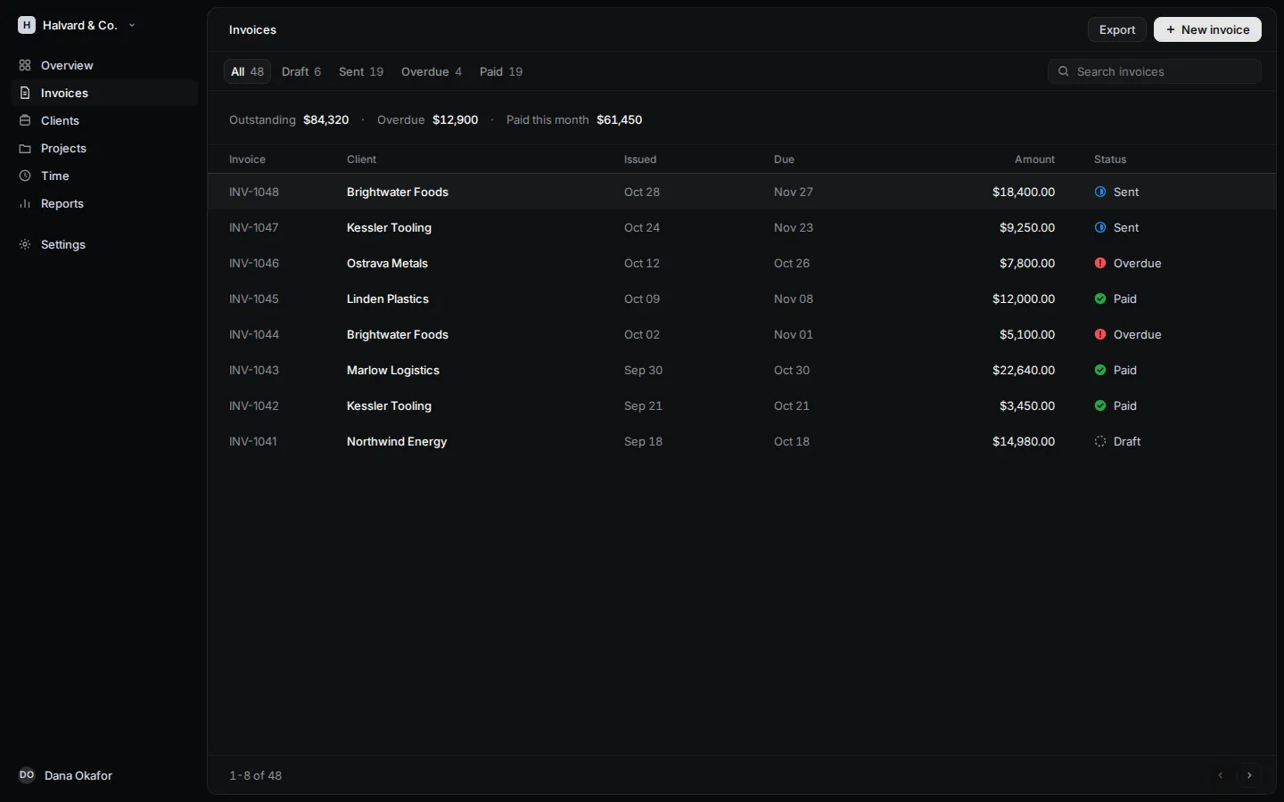
The signature
Hierarchy is made with light, not colour: three near-blacks one step apart (page, inset work surface, raised control) separated by 8% white hairlines, and four tiers of cool grey text. The type is small and set at an in-between medium weight (510), so even dense lists look calm. The only saturated colour is a small status mark.
Credit
After Linear (linear.app), widely regarded as the reference for modern product UI. Our own re-making on fictional content, not affiliated. Visit linear.app
The preview is our own re-making in free fonts, with our own sample content. Nothing from the source is shown here.
Palette
- page#08090A
- panel#0F1011
- raised#161718
- washrgba(255,255,255,0.04)
- ink-1#F7F8F8
- ink-2#D0D6E0
- ink-3#8A8F98
- ink-4#7D8289
- linergba(255,255,255,0.08)
- line-softrgba(255,255,255,0.05)
- fill#E5E5E6
- state-ok#27A644
- state-late#F34E52
- state-open#1C85E8
Fonts
- DisplayInter510
- TextInter400, 510, 590
- MonoGeist Mono400
Sign in to see the full guide
The guide is the whole recipe for Lowlight: type sizes, colour roles, spacing, layout, components, and the rules your agent must never break. It is free with a DevThrottle account.